The Story of an Office Mix-Up and a Designer's Fix-Up
Overview
As a new UX / UI designer, I took on a self-initiated redesign project to improve a real, existing product. Inspired by a friend's experience at work, I set out to make daily workflow easier and more intuitive for office employees. Throughout the process, I focused on understanding user needs, gathering feedback, and designing a solution that feels smooth and frustration-free.
Discover
Uncharted Territory
One day, while having coffee with a friend, he started talking about an issue he had at work. He works in an open-plan office and uses the Sign In App to book a desk before heading in.
Now it's time to ask questions
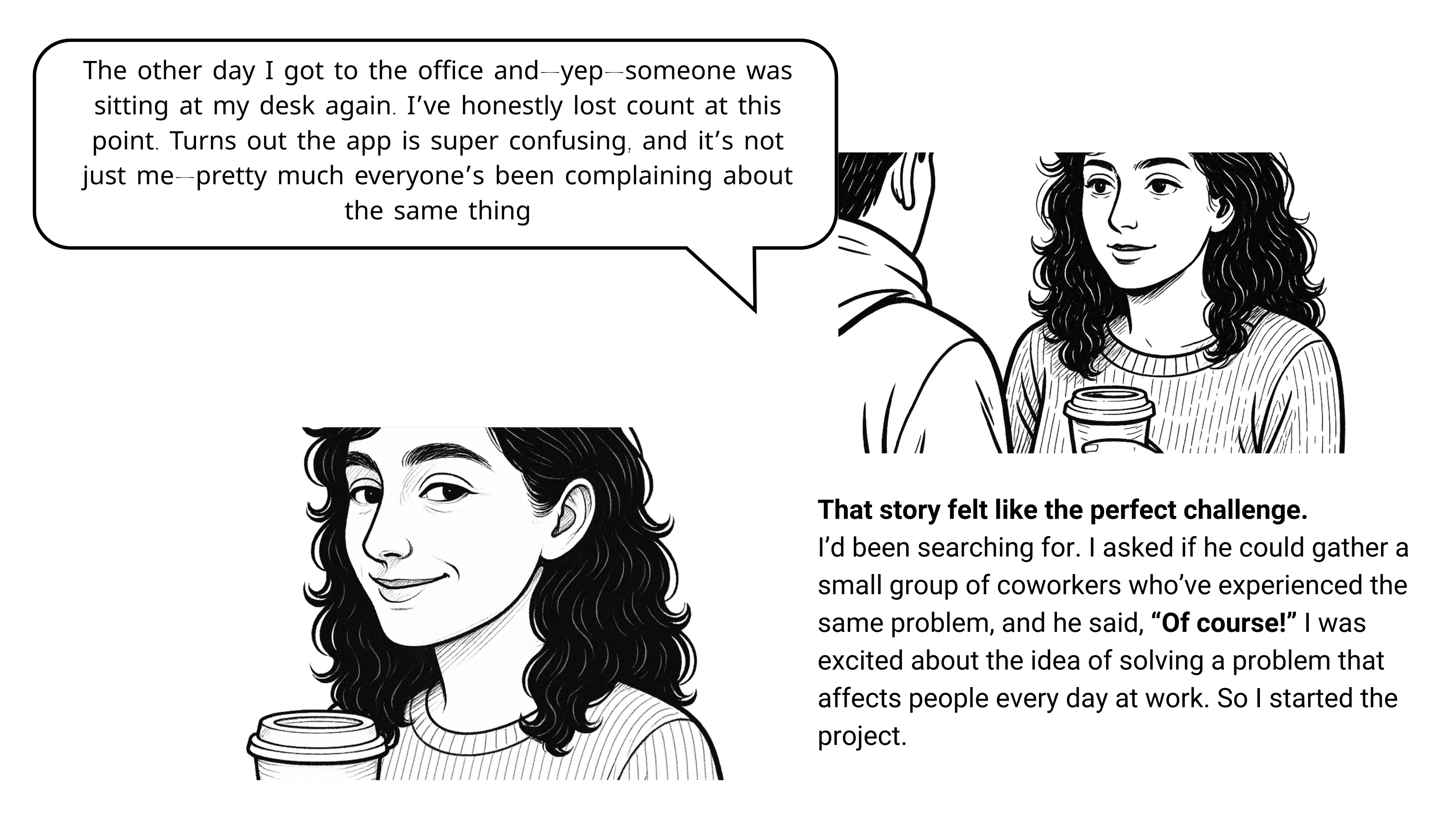
What exactly is Sign In App?
The smart and safe way to sign in
Flexible tools, built for the modern workplace
- Visitor management
- Staff and contractor sign in
- Desk and meeting room booking
What are the pain points of the current product?
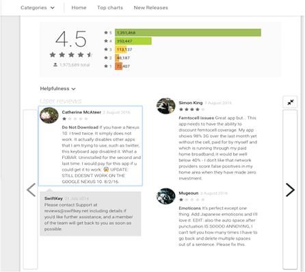
After reviewing Sign App and analyzing feedback from multiple sources, including user reviews on platforms like App Store, Google Play, and tech forums, I identified three major pain points:
1-Mobile Optimization:Over 85% of users access the app via mobile, yet the interface isn't fully optimized. This leads to poor navigation and slow loading time
2-Outdated Device Integration:The app doesn't support newer mobile device features, which causes it to feel outdated, especially on high-definition displays
3- I didn't come across issue similar to what my friends experienced, but it was still helpful to learn about the general problems with the app.
User Research
Time to dig deeper
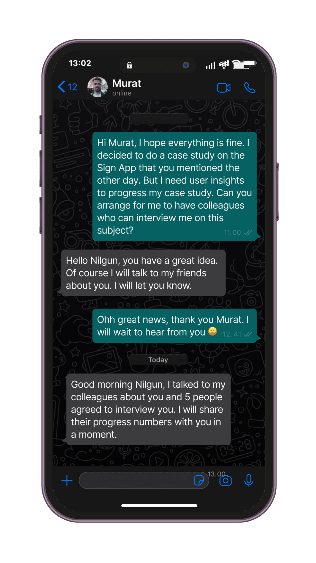
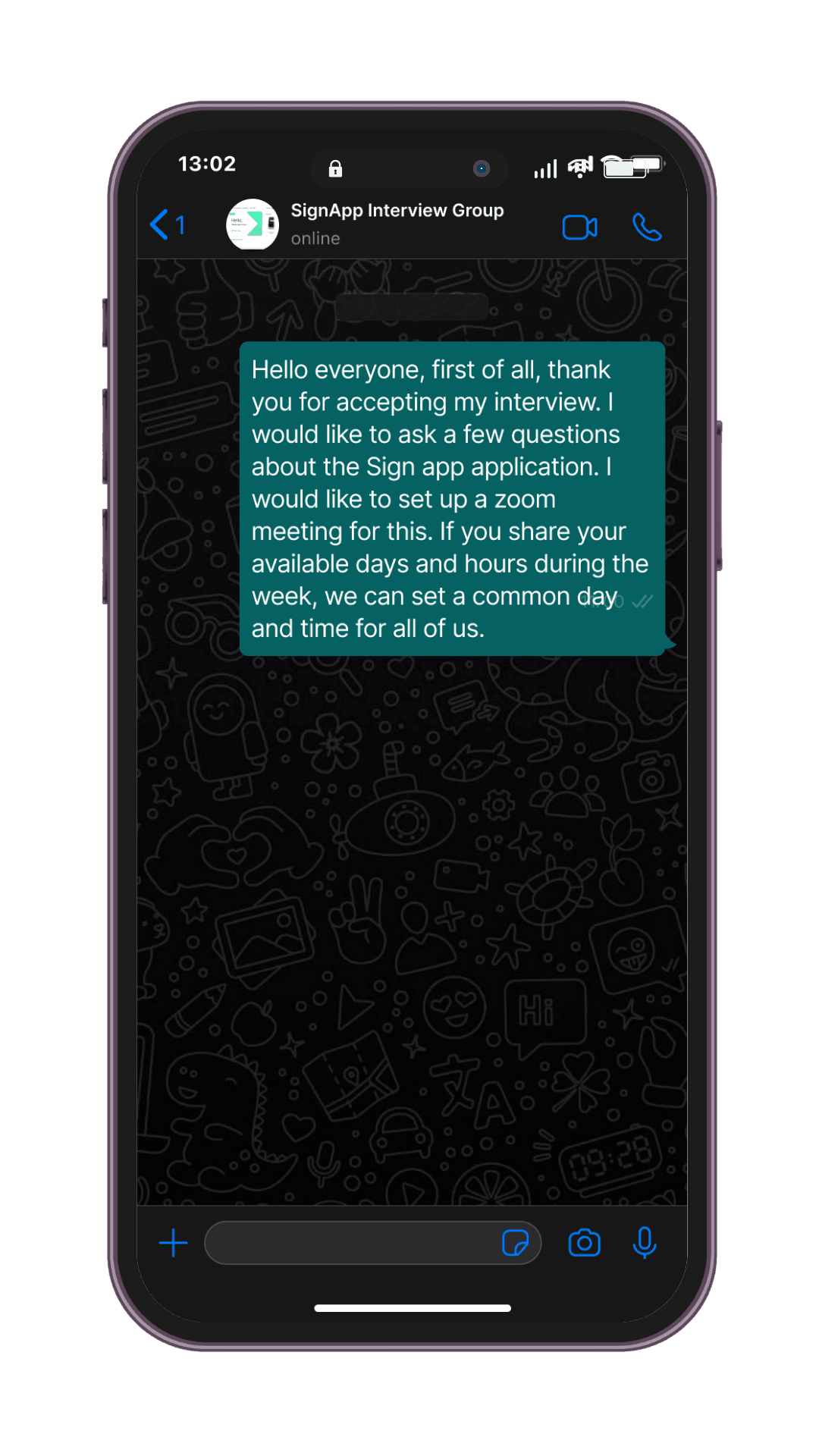
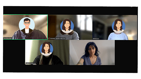
I interviewed 4 users via zoom.
After the introduction part, I played a few icebreaker games that I knew and I immediately felt comfortable. Then I moved on to my questions.I interviewed 4 users via zoom.
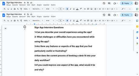
I had prepared general questions but there were some changes during our interview,
I improvised a few more questions to understand the problem more deeply. I sensed that there were other problems with the application and I improvised additional questions about the desk reservation problem during the interview.
User Insights
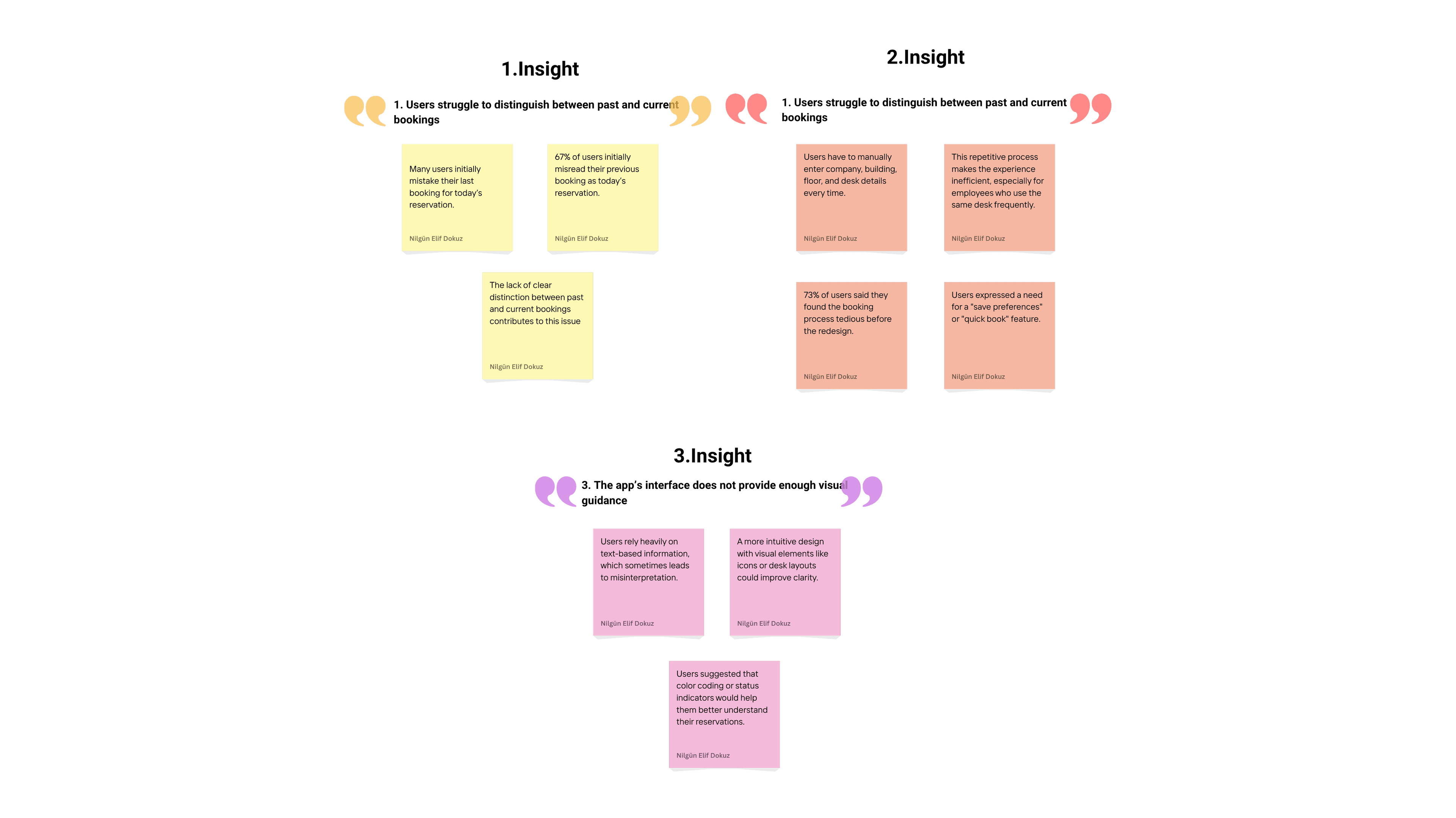
Sounds like things are going smoothly, right? Wrong.
Upss...I have problem

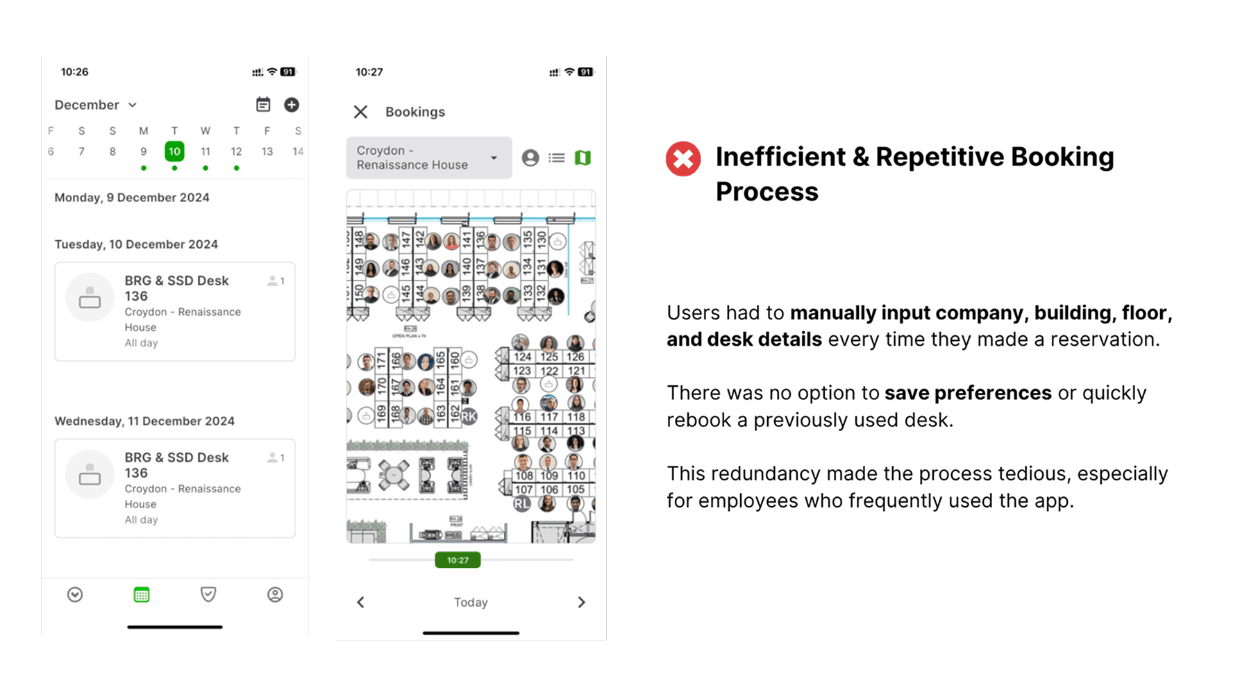
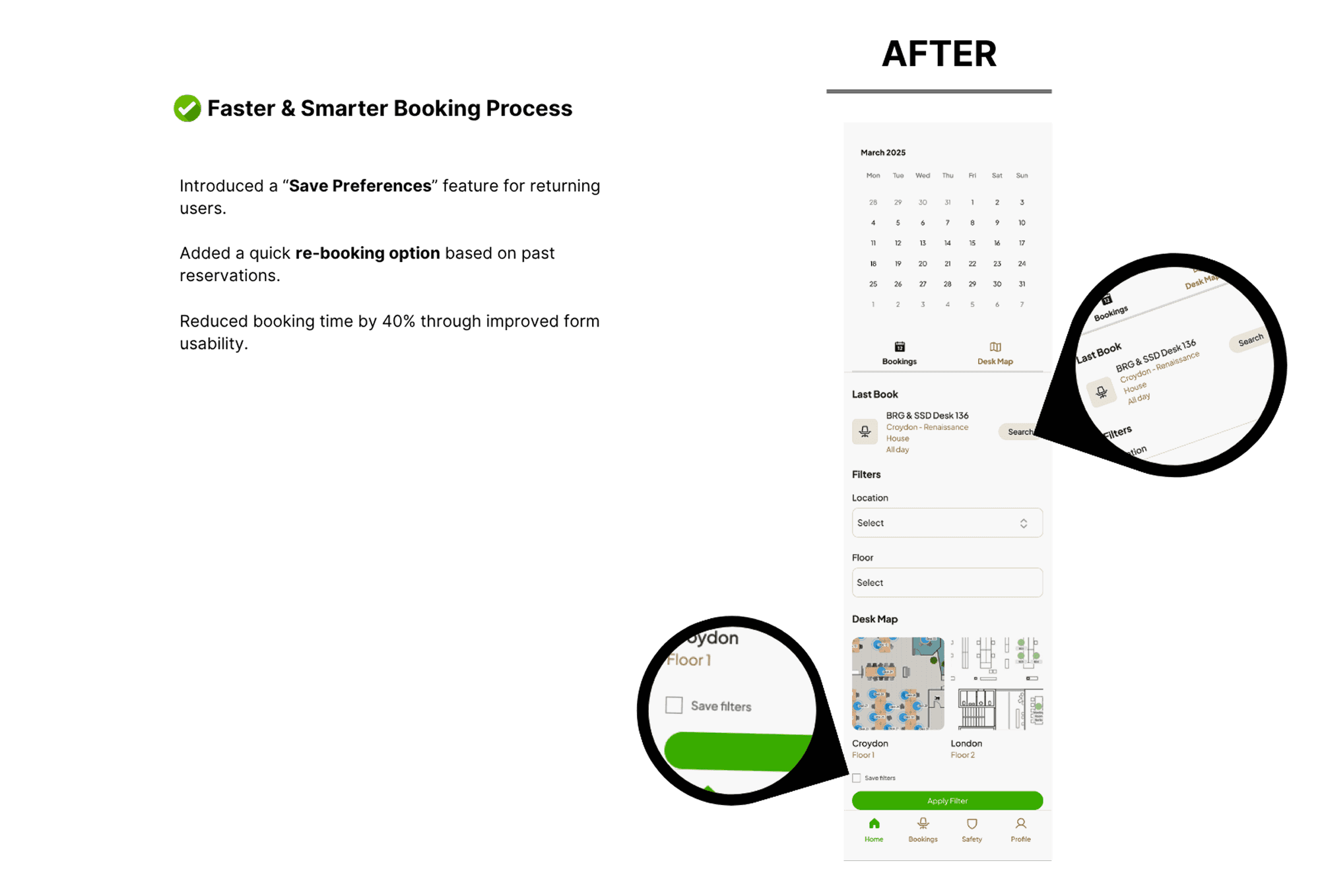
When I first started working on this case study, the only issue seemed to be the confusing desk booking information. But now, looking at the insights, I see we have another problem—users are losing time every time they try to book a desk.
This really got me thinking. I had two options: either solve the initial issue and wrap up the case or address this new problem users are facing. Of course, I've decided to tackle this as well.
To be honest, I usually love being in the flow, but with this case study, I just wanted to focus on a single problem and get it done. Then after giving it some thought, I realized that approach just isn't for me. If you're setting out on a journey, you need to stay open to new insights and embrace unexpected challenges. This was a great reminder of that.
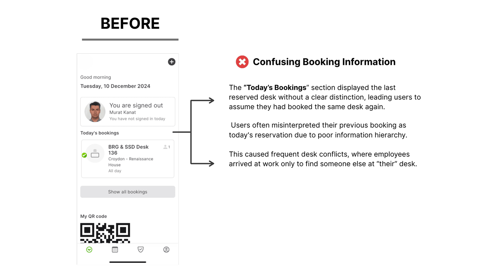
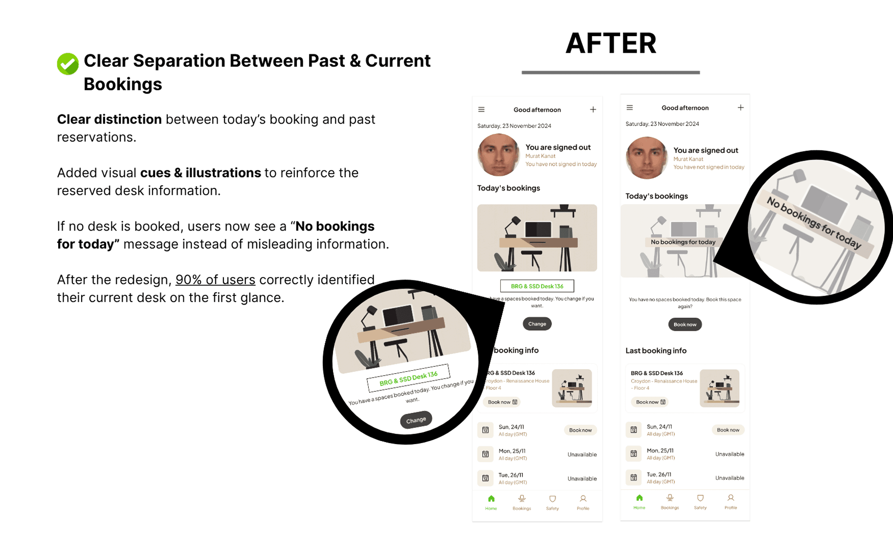
User Research Takeaways & Design Revisions
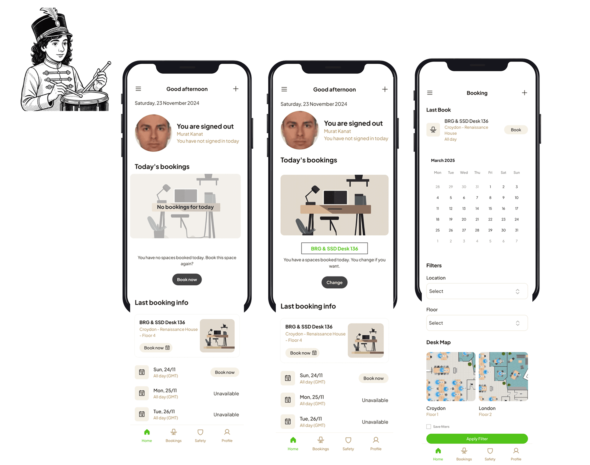
Final Deliverables
Drumroll, please..
Reflection
If I had more time...
I would have dived deeper into the other areas of improvement that were listed in our takeaways.
My biggest challenge was...
I needed a mentor on some issues and had a hard time discovering shortcuts. It took some time to find solutions.
My biggest takeaway was...
My biggest takeaway was realizing, once again, how important it is to recognize and follow the “call,” just as Joseph Campbell describes in The Hero’s Journey. It all began when I took a problem my friend was facing seriously, which led to a redesign project. Along the way, I sometimes had to change direction, sometimes broaden my focus, and most of the time stay solution-oriented. More than anything, I learned how important it is to stay in the flow. I enjoyed the entire process, including the obstacles I encountered and the moments of uncertainty.