From Scratch: A New Designer's First Rollercoaster
Overview
During my UI Design training at UX Design Intuitive, I was given a challenge: to design a banking app. At first, it seemed like just a UI assignment, but it quickly turned into a case study where I could bring all my skills and experience to the table.
In this case study, I'd like to take you on that journey—showing how I approached the challenge, the design decisions I made, and what I learned along the way.
Beyond Design Limits
During my training at UX Design Intuitive, most of the focus was on UI design. For the final project, we were asked to design a next-generation banking app.
The brief highlighted three key principles: Clear, Trustworthy, and Playful.
For me, this project wasn't just another visual design assignment. Since I also had training in UX Design, along with experience in marketing and research, I decided to take the initiative and add a UX layer to the project.
In that sense, this became more than just a design exercise—it was my way of answering the question: “How can I create something more meaningful and user-focused?” Of course, it wasn't an official user research project, but with the experience and resources I had, I managed to build a process that felt as real as possible.

What exactly is this brief?
1. Clear Interface:
Create a design that presents financial data and options in an uncluttered, logical manner, ensuring users can easily navigate and understand their finance
2. Playful Elements:
Incorporate personality through color, shape, and design without compromising usability, aiming to make the banking experience enjoyable.
3. Trustworthy Design
Establish trust by using visual cues, intuitive flows, and secure-looking design elements, balancing the playful aesthetic with a sense of security.
4. Responsive Experience:
Ensure the design is responsive and provides an equally optimized experience across desktop, mobile, and tablet devices.
What do people expect from digital banking?

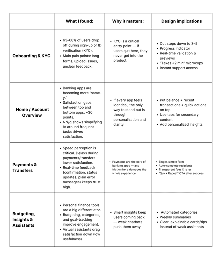
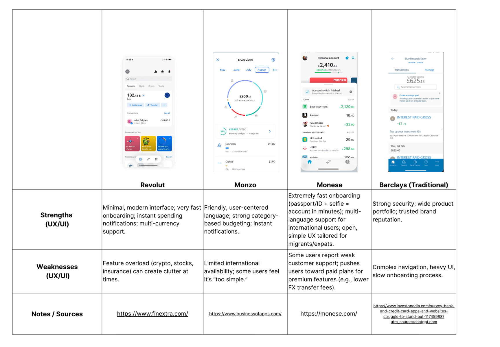
Since I didn't have the chance to speak with real users, I turned to the resources I had. Within the limited time, I did my best to run desk research — digging into reports, articles, competitor apps, and even app store reviews.
To make sense of it all, I categorized my findings and data based on the screens I was going to design.
UX Strategy
Lessons Learned
- Research Always Adds Value: Even lightweight research helps shape clearer design goals and more relevant solutions.
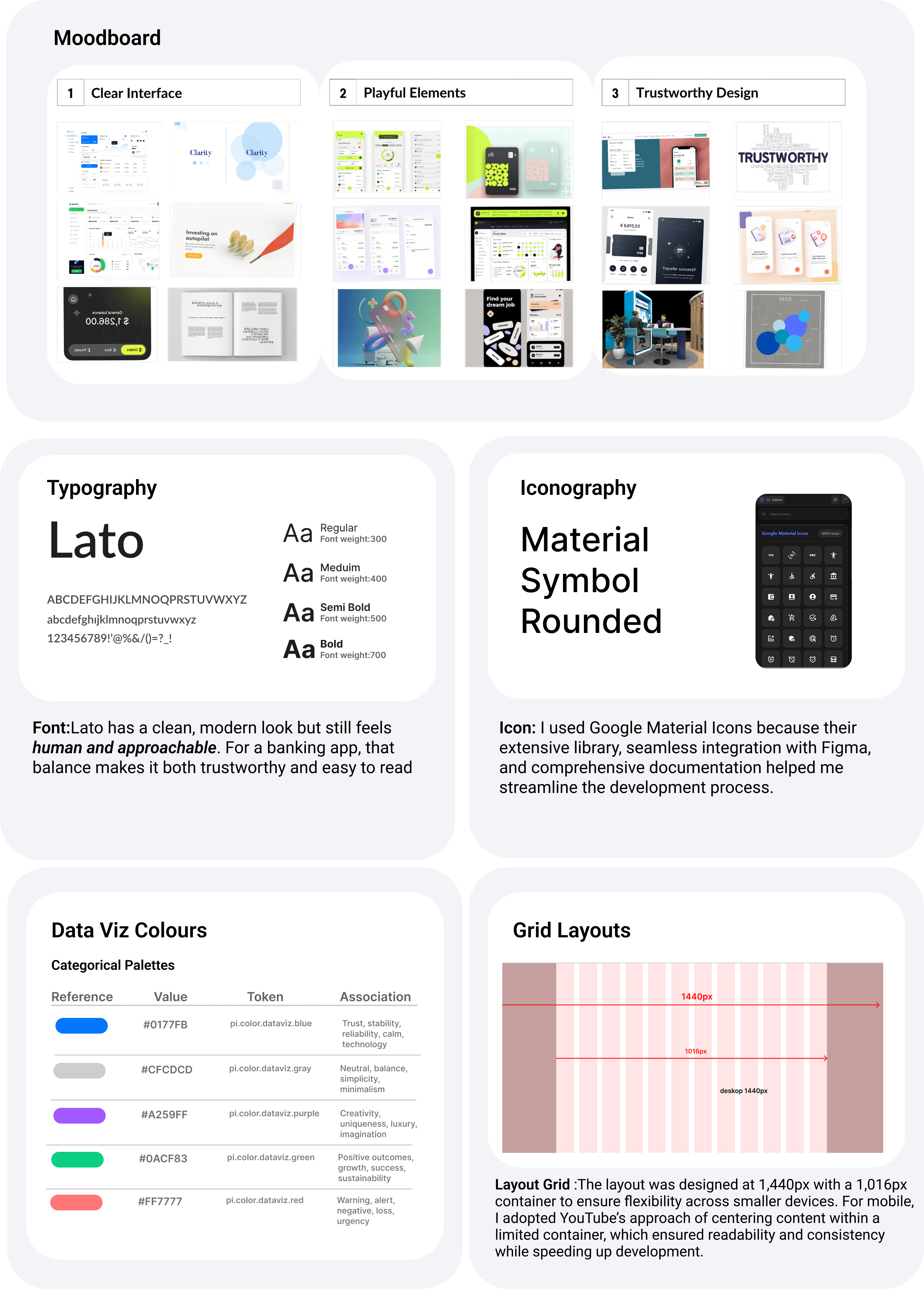
- Details Matter: Choices like typography, icon sets, and colour palettes may seem small, but they build trust in a financial product.
- Balance Between UX & UI:I realised the importance of zooming in and out—understanding the big picture while polishing interface details.
- Constraints Can Drive Creativity: Working with limited time and no research resources taught me to prioritise and adapt fast.
Winning Moments
- Went Beyond the Brief: Although the course only required UI deliverables, I conducted my own UX research to give the project more depth.
- End-to-End Ownership: From moodboard and competitor analysis to final prototypes, I managed all phases myself.
- Kept it Clear, Trustworthy, Playful:Stayed aligned with the project's core values while experimenting with my own design decisions.
Design Foundation
The Power of Boring
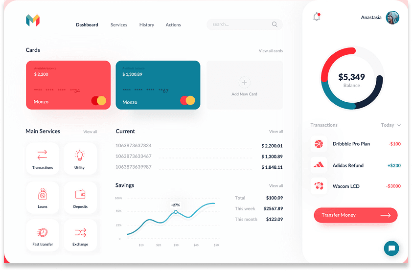
The UX Model (Monzo)
Since I had limited design resources and no time for deep user research, I built my UX approach on Jakob's Law: Users spend most of their time on other apps, so they expect a similar experience from ours.
That's why for DealBank, I aimed to design an experience with zero learning curve. I referenced the interface patterns popularized by competitors like Monzo, Revolut, and N26. This way, when users first open the app, nothing feels “new” or “foreign” — familiar flows reinforce a sense of trust.
At the same time, this approach minimizes onboarding time and speeds up future development, since it's built on interface patterns users already know by heart.
The UX Model (Monzo)
Deal Bank
UI decisions
Final Destination
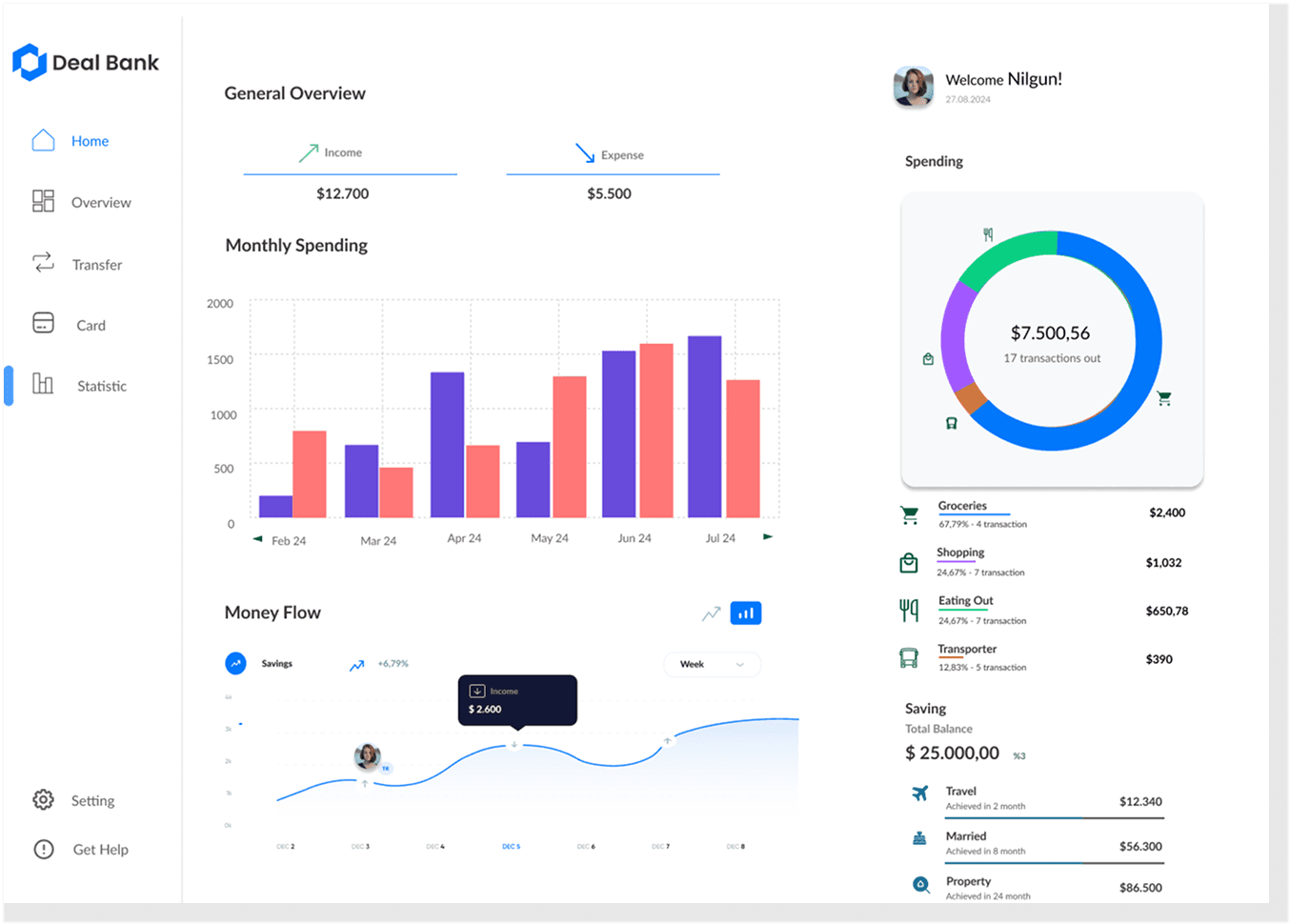
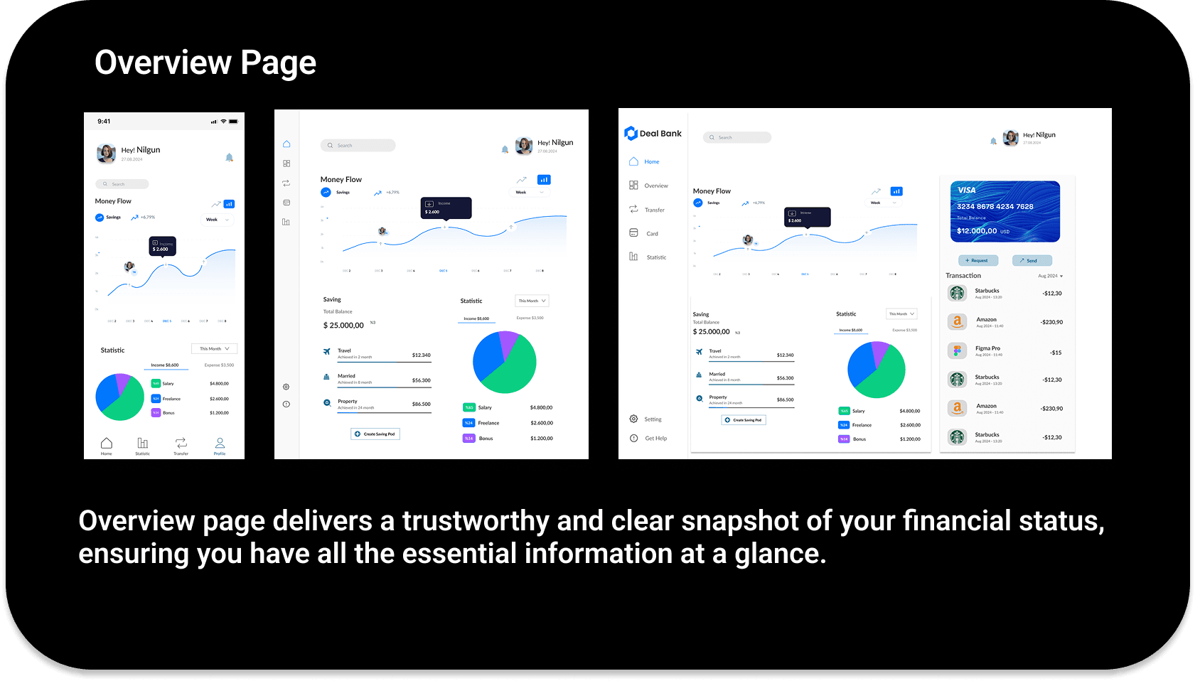
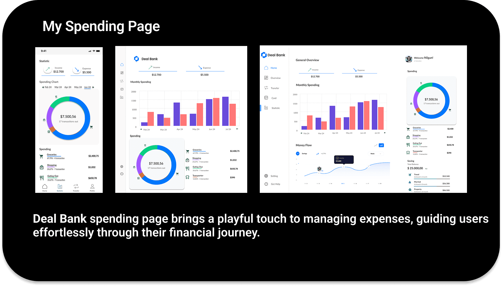
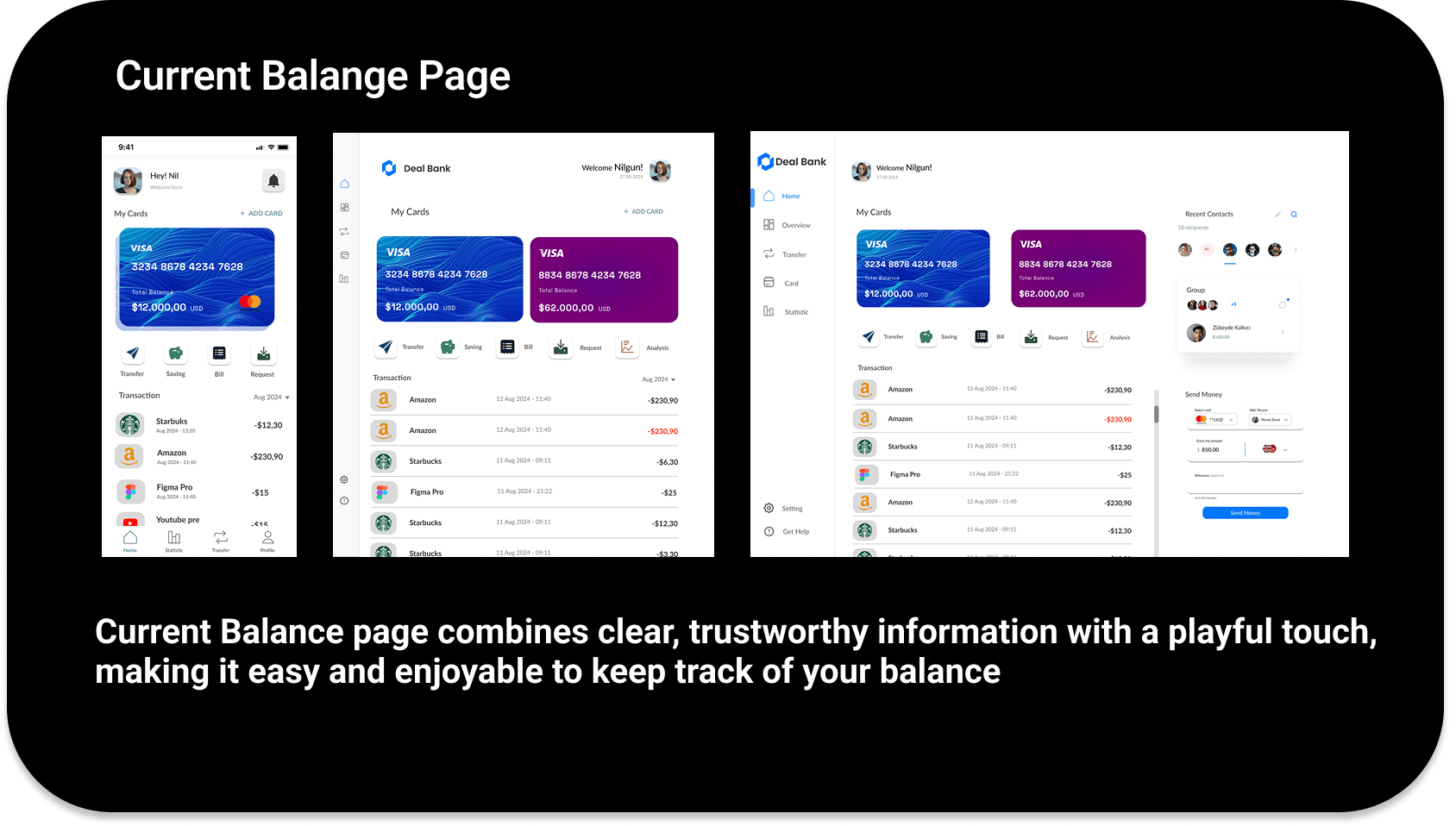
I focused on the small but impactful details of the UI to support clear financial data visualisation. While these adjustments may appear minor, they play a crucial role in making complex financial information easier to read and interpret.

Closing
Journey Ends
This journey started as a UI-focused course project, but I couldn't stop there. With my background in UX research and marketing, I pushed myself to bring in a UX layer as well — making it a more holistic exercise than originally intended.
Winning Moments
- Went Beyond the Brief: Although the course only required UI deliverables, I conducted my own UX research to give the project more depth.
- End-to-End Ownership: From moodboard and competitor analysis to final prototypes, I managed all phases myself.
- Kept it Clear, Trustworthy, Playful:Stayed aligned with the project's core values while experimenting with my own design decisions.
Lessons Learned
- Research Always Adds Value: Even lightweight research helps shape clearer design goals and more relevant solutions.
- Details Matter: Choices like typography, icon sets, and colour palettes may seem small, but they build trust in a financial product.
- Balance Between UX & UI:I realised the importance of zooming in and out — understanding the big picture while polishing interface details.
- Constraints Can Drive Creativity: Working with limited time and no research resources taught me to prioritise and adapt fast.